No products in the cart.
Classic Blue
Classic Blue for 2020
Contributed by Neleisha Weerasinghe.
Classic Blue, 19-4052 it is, the chosen Pantone Color of the year 2020. It is considered an all time favorite and it is a versatile one as well. According to pantone, this classic favorite is meant to give a sense of peace, calm and confidence. Now that the color is announced, it is interesting to note some facts about the history of blue.
It is said that the blue pigments were first created by the Egyptians in an effort to create artisan materials and other artworks that could be permanently colored. Although their efforts didn’t create a true pigment, they were able to create a color known as ‘Egyptian Blue’ made out of the mineral lapis lazuli. They used this to decorate their tombs and other creations.
Last year the color Living Coral was all about life and the ecosystem but this time it is centered on spirituality and the soul. Pantone states that their selection is meant to emphasize the importance of a calm and centered human spirit. These reasons and many more have made this pigment a favorite among artists, designers, interior decorators and many others.
Representation
This color though very common and vastly used, denotes a deep meaning and it is widely used in many instances such as:
- Authority: blue, especially the darker shade is used to represent authority hence you will find many uniforms using this color. In the corporate world too, it is used as part of a more professional attire.
- Communication: blue is also identified as the color of communication and hence you will find many telecommunications companies using this in their branding.
As we are all aware, the first thing that comes to mind when thinking of blue is the sky, therefore consequently, it symbolizes, faith, truth, wisdom and heaven. We also know that color has the capacity to affect our moods and emotions. Red is considered aggressive and is considered useful in creating an appetite, hence you will find many fast food chains using it. However, blue is quite the opposite, it is meant to create a sense of stability and peace. It is also great to uplift the human spirit hence it is very good for the mind and body. However, it is said that blue is not a great color for appetite as it diminishes it. So ideally not good for restaurants or even the dining room at home.
Blue in art

Many artists have used this color to great effect. Pablo Picasso famously had a blue period where he only made artworks with different shades of blue. Since its discovery by the Egyptians, many cultures have tried to create their own pigments of blue, however up until the 6th century no one was said to have been able to create a true-blue pigment. This was found in Buddhist paintings in Afghanistan and later transported to Europe with the name that we know today as Ultramarine. It was a highly sought after color and had a high price tag as well. Because of this it was used very sparingly and used only for royalty and the very rich. Likewise, there are many other shades found by accident and some made with special chemicals. Cobalt blue is another great find this time discovered by the Chinese, with their manufacturing of pottery where the popular blue and white porcelain highlights this find. Van Gogh and Renoir popularized this color with their many famous paintings. These are just two examples, there are many more such as Prussian blue, Cerulean blue and YInMn that really is above the scope of this article.
Blue in interiors

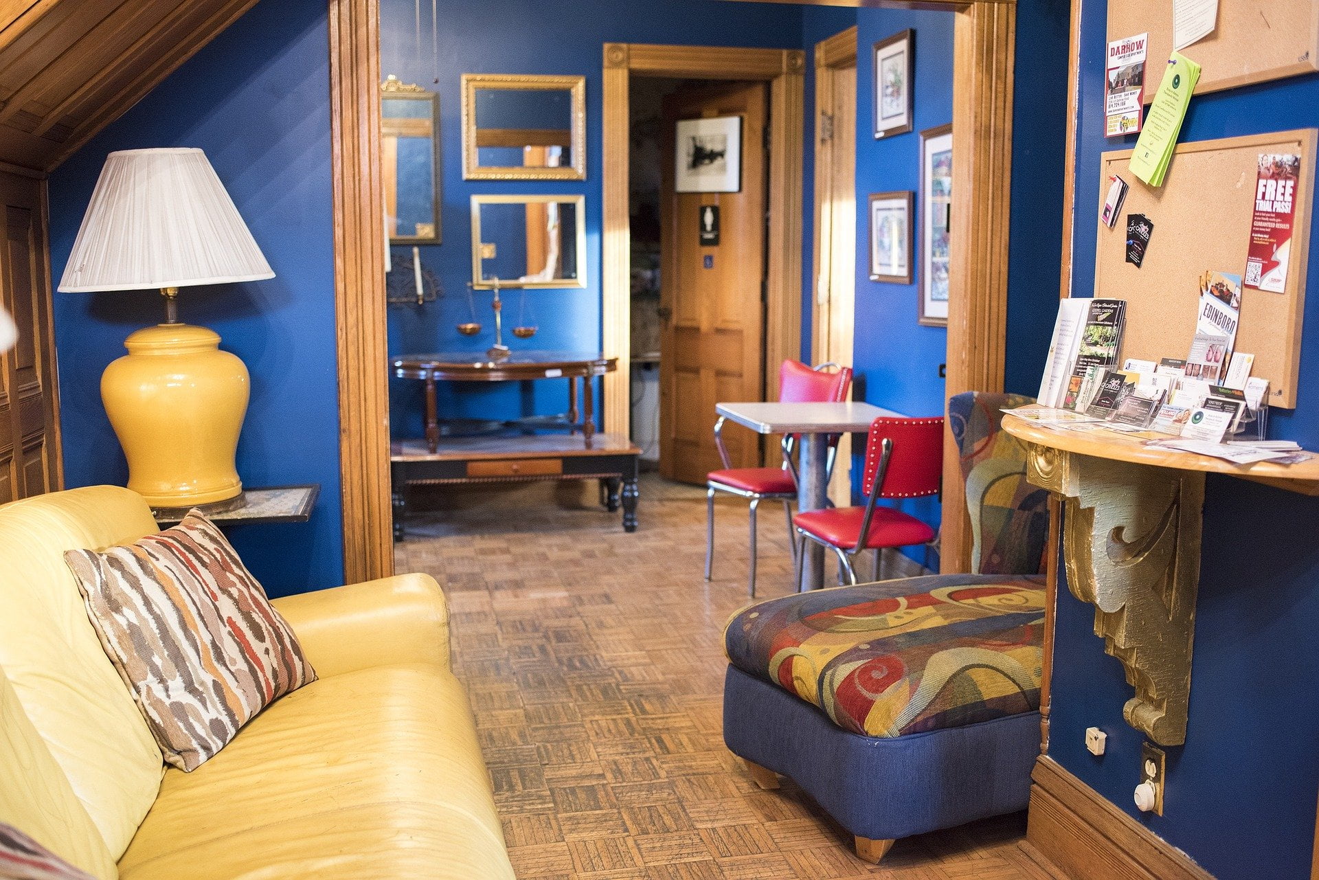
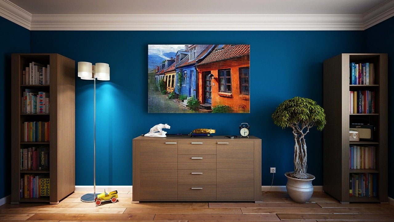
Even before it was named color of the year 2020, classic blue had a prominent place within the world of interior decoration. It has been used with great effect to create aesthetically pleasing as well as functional spaces. Let’s look at some of the tips experts give on using this for best results.
- Its all in the shade: blue can be a very strong colour and it has its different shades from pale to dark so you need to mix and match what you plan to include in the space accordingly. If dark blue is added on a wall then complimenting it with furniture and rugs in lighter colours or with patterns is recommended. Blue is naturally calming but having too much of the same shade can be a tad overwhelming.
- Use complimenting colours: when you look at a colour wheel you will notice that orange is the compliment colour of blue, therefore if you have styled the interior in shades of blue then adding accents or accessories in orange, yellow and even coral can help to create a balanced interior.

There is plenty of ideas on the internet and print media already to help you with your own creative projects.
With its many variations and possibilities, blue is truly a wonderful color to use with your imagination. Even if you are not the artist or creative type, I am sure looking at the sky or the sea gives you a sense of calmness and hopefully classic blue will do the same for this new decade.


